Contents
- 🔍 Introduction to Data Visualization
- 📊 The Evolution of Data Visualization Tools
- 📈 Benefits of Data Visualization
- 📊 Types of Data Visualization Tools
- 📁 Data Preparation for Visualization
- 📈 Best Practices for Effective Data Visualization
- 📊 Common Data Visualization Tools
- 📈 Real-World Applications of Data Visualization
- 📊 Challenges and Limitations of Data Visualization
- 📈 Future of Data Visualization
- 📊 Conclusion
- Frequently Asked Questions
- Related Topics
Overview
The use of data visualization tools has become a crucial aspect of data analysis, enabling users to uncover hidden patterns, trends, and correlations within complex data sets. With the help of tools like Tableau, Power BI, and D3.js, data visualization has become more accessible and user-friendly, allowing non-technical stakeholders to gain insights and make data-driven decisions. According to a report by Gartner, the data visualization market is expected to reach $10.2 billion by 2025, with a growth rate of 12.2% per annum. However, the increasing reliance on data visualization tools also raises concerns about data accuracy, interpretation, and potential biases. As the field continues to evolve, it's essential to consider the tension between data visualization as a tool for discovery and its potential to mislead or manipulate. For instance, a study by the University of California, Berkeley found that 71% of data visualizations contain errors or inaccuracies, highlighting the need for critical evaluation and skepticism when working with data visualization tools. As we move forward, it's crucial to develop a deeper understanding of the strengths and limitations of data visualization and its potential impact on decision-making processes.
🔍 Introduction to Data Visualization
Data visualization is the process of creating graphical representations of data to better understand and communicate complex information. Data Science has become a crucial aspect of various industries, and Data Visualization plays a key role in it. With the help of Data Visualization Tools, organizations can unlock insights and make data-driven decisions. The use of data visualization tools has become increasingly popular, and companies like Tableau and Power BI are leading the way. As John Tukey once said, 'The greatest value of a picture is when it forces us to notice what we never expected to see.'
📊 The Evolution of Data Visualization Tools
The evolution of data visualization tools has been significant over the years. From simple Bar Charts and Line Graphs to complex Interactive Dashboards and Geospatial Visualizations, the options are endless. Edward Tufte is a pioneer in the field of data visualization, and his work has inspired many. The development of D3.js and other data visualization libraries has made it easier for developers to create custom visualizations. Companies like Google and Microsoft are also investing heavily in data visualization research and development.
📈 Benefits of Data Visualization
The benefits of data visualization are numerous. It helps in Data Analysis, Pattern Recognition, and Trend Identification. Data visualization also facilitates Communication and Collaboration among team members. Stephen Few is a well-known expert in the field of data visualization, and his work focuses on the effective use of visualization in business decision-making. With the help of data visualization tools, organizations can gain a competitive edge and make informed decisions. Data-Driven Decision Making is becoming increasingly popular, and data visualization is at the core of it.
📊 Types of Data Visualization Tools
There are various types of data visualization tools available, including Desktop Applications, Web-Based Tools, and Mobile Applications. Tableau and Power BI are popular desktop applications, while D3.js and Plotly are popular web-based tools. Data Studio is a free tool offered by Google, and it provides a range of data visualization options. The choice of tool depends on the specific needs of the organization and the type of data being visualized. Data Visualization Best Practices should be followed to ensure effective visualization.
📁 Data Preparation for Visualization
Data preparation is a critical step in the data visualization process. It involves Data Cleaning, Data Transformation, and Data Aggregation. Data Warehousing and ETL (Extract, Transform, Load) are also important aspects of data preparation. Apache Spark and Pandas are popular tools used for data preparation. The quality of the data has a direct impact on the quality of the visualization, and therefore, it is essential to invest time and effort in data preparation. Data Quality is a critical aspect of data visualization, and it should not be compromised.
📈 Best Practices for Effective Data Visualization
Best practices for effective data visualization include Keeping it Simple, Using Color Effectively, and Avoiding 3D. Labeling and Annotating the visualization are also important aspects of effective data visualization. Storytelling with data is becoming increasingly popular, and it involves using data visualization to tell a story. Nathan Yau is a well-known expert in the field of data visualization, and his work focuses on the effective use of visualization in storytelling. The goal of data visualization is to communicate insights and trends, and therefore, it is essential to follow best practices.
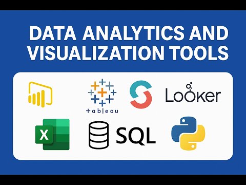
📊 Common Data Visualization Tools
There are various data visualization tools available, including Tableau, Power BI, and D3.js. Plotly and Matplotlib are also popular tools used for data visualization. Google Data Studio is a free tool offered by Google, and it provides a range of data visualization options. The choice of tool depends on the specific needs of the organization and the type of data being visualized. Data Visualization Tools Comparison can help organizations make an informed decision.
📈 Real-World Applications of Data Visualization
Data visualization has various real-world applications, including Business Intelligence, Scientific Research, and Social Media Analysis. Healthcare and Finance are also industries that heavily rely on data visualization. Data Journalism is becoming increasingly popular, and it involves using data visualization to tell stories. The New York Times and The Guardian are well-known examples of organizations that use data visualization in journalism. The use of data visualization in real-world applications is endless, and it continues to grow.
📊 Challenges and Limitations of Data Visualization
There are various challenges and limitations of data visualization, including Data Quality Issues, Information Overload, and Interpretation Challenges. Data Privacy and Security are also important aspects of data visualization. Data Visualization Ethics should be followed to ensure that the visualization is fair and unbiased. The use of data visualization can also be misleading if not done correctly, and therefore, it is essential to be aware of the challenges and limitations.
📈 Future of Data Visualization
The future of data visualization is exciting, with Artificial Intelligence and Machine Learning playing a significant role. Augmented Reality and Virtual Reality are also being explored in the field of data visualization. Data Visualization Trends are constantly evolving, and it is essential to stay up-to-date with the latest developments. The use of data visualization will continue to grow, and it will become an essential aspect of various industries.
📊 Conclusion
In conclusion, data visualization is a powerful tool that can help organizations unlock insights and make data-driven decisions. With the help of data visualization tools, organizations can create interactive and dynamic visualizations that communicate complex information effectively. The benefits of data visualization are numerous, and it has various real-world applications. However, there are also challenges and limitations that need to be addressed. The future of data visualization is exciting, and it will continue to play a significant role in various industries.
Key Facts
- Year
- 2022
- Origin
- Vibepedia
- Category
- Data Science
- Type
- Concept
Frequently Asked Questions
What is data visualization?
Data visualization is the process of creating graphical representations of data to better understand and communicate complex information. It involves using various tools and techniques to create interactive and dynamic visualizations that communicate insights and trends. Data visualization is a crucial aspect of Data Science and has various real-world applications.
What are the benefits of data visualization?
The benefits of data visualization are numerous, including Data Analysis, Pattern Recognition, and Trend Identification. Data visualization also facilitates Communication and Collaboration among team members. It helps organizations make data-driven decisions and gain a competitive edge.
What are the different types of data visualization tools?
There are various types of data visualization tools available, including Desktop Applications, Web-Based Tools, and Mobile Applications. Tableau and Power BI are popular desktop applications, while D3.js and Plotly are popular web-based tools.
What is the future of data visualization?
The future of data visualization is exciting, with Artificial Intelligence and Machine Learning playing a significant role. Augmented Reality and Virtual Reality are also being explored in the field of data visualization. The use of data visualization will continue to grow, and it will become an essential aspect of various industries.
What are the challenges and limitations of data visualization?
There are various challenges and limitations of data visualization, including Data Quality Issues, Information Overload, and Interpretation Challenges. Data Privacy and Security are also important aspects of data visualization. The use of data visualization can also be misleading if not done correctly, and therefore, it is essential to be aware of the challenges and limitations.