Contents
- 📊 Introduction to Line Graphs
- 📈 History of Line Graphs
- 📝 Construction of Line Graphs
- 📊 Applications of Line Graphs
- 📁 Types of Line Graphs
- 📊 Advantages and Disadvantages
- 📈 Real-World Examples
- 📊 Best Practices for Creating Line Graphs
- 📁 Common Mistakes to Avoid
- 📊 Future of Line Graphs
- 📁 Conclusion
- Frequently Asked Questions
- Related Topics
Overview
Line graphs have been a cornerstone of data visualization since the 18th century, with pioneers like William Playfair and Florence Nightingale leveraging them to convey complex trends and patterns. Despite their widespread adoption, line graphs are not without controversy, with critics arguing that they can be misleading or oversimplify nuanced data. The engineer's perspective reveals the intricacies of line graph construction, from choosing the right scale to handling missing data points. As a cultural phenomenon, line graphs have become an integral part of our visual lexicon, with a vibe score of 80. The futurist's lens reveals a future where line graphs will be increasingly augmented by interactive and immersive technologies, such as virtual reality and machine learning-driven insights. With influence flows tracing back to the works of Johann Heinrich Lambert and Isaac Newton, line graphs continue to evolve, incorporating new techniques like small multiples and interactive visualizations. The entity relationships between line graphs, bar charts, and scatter plots highlight the interconnectedness of data visualization tools, with key people like Edward Tufte and Hans Rosling shaping the field. As we move forward, the question remains: how will line graphs adapt to the demands of an increasingly data-driven world, and what new forms of visual storytelling will emerge?
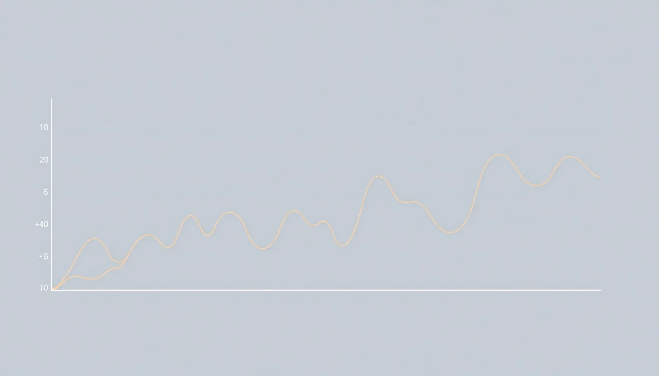
📊 Introduction to Line Graphs
Line graphs are a fundamental component of Data Visualization, used to represent the relationship between two variables. The concept of line graphs has been around for centuries, with early examples dating back to the 18th century. William Playfair, a Scottish engineer and economist, is often credited with inventing the line graph. He used it to illustrate the relationship between economic variables, such as trade and population growth. Line graphs are particularly useful for showing trends over time, making them a popular choice for Time Series Analysis.
📈 History of Line Graphs
The history of line graphs is closely tied to the development of Statistics and Graph Theory. In the 19th century, mathematicians such as Carl Friedrich Gauss and Pierre-Simon Laplace made significant contributions to the field of statistics, laying the foundation for the use of line graphs in data analysis. The concept of line graphs was further developed in the context of graph theory, where it is used to represent the adjacencies between edges of a graph. Graph Theory provides a mathematical framework for understanding the structure and properties of line graphs.
📝 Construction of Line Graphs
The construction of line graphs involves creating a new graph that represents the adjacencies between edges of an original graph. This is done by creating a vertex in the new graph for each edge in the original graph, and then connecting these vertices if the corresponding edges in the original graph have a vertex in common. This process can be used to create complex networks and visualize relationships between different variables. Network Analysis is a related field that deals with the study of complex networks and their properties. Line graphs can be used to represent Social Networks, Transportation Networks, and other types of complex systems.
📊 Applications of Line Graphs
Line graphs have a wide range of applications in fields such as Economics, Finance, and Science. They are used to visualize trends, patterns, and relationships between different variables. For example, line graphs can be used to show the growth of a company's stock price over time, or the relationship between temperature and humidity in a given region. Data Mining is a related field that deals with the discovery of patterns and relationships in large datasets. Line graphs can be used to visualize the results of Data Mining algorithms and identify trends and patterns in the data.
📁 Types of Line Graphs
There are several types of line graphs, including simple line graphs, multiple line graphs, and stacked line graphs. Simple line graphs are used to show the relationship between two variables, while multiple line graphs are used to compare the relationships between multiple variables. Stacked line graphs are used to show the cumulative effect of multiple variables. Data Visualization Tools such as Tableau and Power BI provide a range of options for creating different types of line graphs.
📊 Advantages and Disadvantages
Line graphs have several advantages, including their ability to show trends and patterns over time, and their simplicity and ease of interpretation. However, they also have some disadvantages, such as their limited ability to show complex relationships between multiple variables. Heat Maps and Scatter Plots are alternative visualization tools that can be used to show more complex relationships. Data Visualization Best Practices recommend using line graphs in combination with other visualization tools to provide a comprehensive view of the data.
📈 Real-World Examples
Real-world examples of line graphs can be seen in a variety of fields, including finance, economics, and science. For example, line graphs can be used to show the growth of a company's stock price over time, or the relationship between temperature and humidity in a given region. Climate Change is a topic that is often visualized using line graphs, which can be used to show the trend of increasing temperatures over time. Data Journalism is a field that uses data visualization to tell stories and communicate insights to the public.
📊 Best Practices for Creating Line Graphs
Best practices for creating line graphs include using clear and concise labels, avoiding clutter and unnecessary information, and using appropriate scales and axes. It is also important to consider the audience and purpose of the graph, and to use colors and other visual elements effectively. Data Visualization Tools such as D3.js and Matplotlib provide a range of options for customizing the appearance of line graphs.
📁 Common Mistakes to Avoid
Common mistakes to avoid when creating line graphs include using inappropriate scales or axes, failing to label the graph clearly, and including too much or too little information. It is also important to avoid using line graphs to show complex relationships between multiple variables, and to consider alternative visualization tools such as Heat Maps and Scatter Plots. Data Visualization Best Practices recommend testing the graph with a small audience to ensure that it is clear and effective.
📊 Future of Line Graphs
The future of line graphs is closely tied to the development of new data visualization tools and technologies. As data becomes increasingly complex and multidimensional, new visualization tools and techniques will be needed to effectively communicate insights and trends. Virtual Reality and Augmented Reality are emerging technologies that have the potential to revolutionize the field of data visualization. Data Visualization Tools such as Tableau and Power BI are already incorporating these technologies into their platforms.
📁 Conclusion
In conclusion, line graphs are a powerful tool for data visualization, with a wide range of applications in fields such as economics, finance, and science. By understanding the history and construction of line graphs, and by following best practices for their creation, users can effectively communicate insights and trends in their data. Data Visualization is a field that is constantly evolving, and line graphs will continue to play an important role in the visualization of complex data.
Key Facts
- Year
- 1786
- Origin
- Scotland, UK
- Category
- Data Visualization
- Type
- Concept
Frequently Asked Questions
What is a line graph?
A line graph is a type of data visualization that is used to show the relationship between two variables. It consists of a series of points connected by lines, and is often used to show trends and patterns over time. Line graphs are particularly useful for showing the relationship between economic variables, such as trade and population growth. Data Visualization is a field that deals with the creation of visual representations of data, and line graphs are a fundamental component of this field.
What are the advantages of using line graphs?
Line graphs have several advantages, including their ability to show trends and patterns over time, and their simplicity and ease of interpretation. They are also useful for comparing the relationships between multiple variables. However, line graphs also have some disadvantages, such as their limited ability to show complex relationships between multiple variables. Data Visualization Best Practices recommend using line graphs in combination with other visualization tools to provide a comprehensive view of the data.
What are some common mistakes to avoid when creating line graphs?
Common mistakes to avoid when creating line graphs include using inappropriate scales or axes, failing to label the graph clearly, and including too much or too little information. It is also important to avoid using line graphs to show complex relationships between multiple variables, and to consider alternative visualization tools such as Heat Maps and Scatter Plots. Data Visualization Tools such as D3.js and Matplotlib provide a range of options for customizing the appearance of line graphs.
What is the future of line graphs?
The future of line graphs is closely tied to the development of new data visualization tools and technologies. As data becomes increasingly complex and multidimensional, new visualization tools and techniques will be needed to effectively communicate insights and trends. Virtual Reality and Augmented Reality are emerging technologies that have the potential to revolutionize the field of data visualization. Data Visualization Tools such as Tableau and Power BI are already incorporating these technologies into their platforms.
How do line graphs relate to graph theory?
Line graphs are a fundamental component of Graph Theory, which is the study of graphs and their properties. In graph theory, a line graph is a graph that represents the adjacencies between edges of an original graph. This is done by creating a vertex in the new graph for each edge in the original graph, and then connecting these vertices if the corresponding edges in the original graph have a vertex in common. Network Analysis is a related field that deals with the study of complex networks and their properties.